Infographics
As a classroom teacher, I always enjoy incorporating visuals into my lessons. I learn best when I have visuals to refer to so I always try to help those learners who are like me.
In my classroom I have anchor charts for the different subjects and content that I teach, and I am so glad I now know about infographics!
One way that came to mind as to how I could use infographics in the library would be to show how reading can help improve students fluency.
I can create an infographic to show data of the fluency rate of students who read a certain amount of books a day compared to other students who read less or more books a day.
I will definitely be thinking of more ways to incorporate infographics as it is sometimes easier and faster to visually see data drawn and written out rather than having to read about the data (and visual learners like me would agree!)
I tried out three different websites to create an infographic:
Easel.ly, Piktochart, and Infogram
Here is how my experience went:
1. Easil.ly-
I was able to create an account using my Gmail so it was quick and easy to sign up. With a free account, there are various templates that are already created and you are able to edit the templates to your liking. Although there are many to look through and edit, a lot of the other various features are not free and require an upgraded account which you have to pay for. Using Easil.ly would appeal to users who want to create basic infographics, but I would not suggest using Easil.ly if you are wanting to create a detailed infographic.
2. Piktochart-
Creating a Piktochart account was easy and simple as I was able to use my Gmail account. Using Piktochart, you are able to create an infographic, presentation, poster, reports, flyers, or use templates for various social media applications. Piktochart offers features that let you alter every detail of your infographic with your free account. There are various chart options to choose from, and creating a chart is simple with the data sheet that opens and allows you to edit the view and data of the chart anyway that you choose.
3. Infogram-
I was able to easily connect my Gmail account and use it to sign up. With a free account, you are able to create an infographic, report, slide show, dashboard, poster, social media post, email headers, YouTube thumbnails, and much more. Although you are able to create graphics for these categories, much of the templates are only available if you have an upgraded account which you must pay for. Creating an infographic was a bit difficult because there are many features that pop-up while editing and it can be intimidating to some.
After trying out all three websites, I decided to stick with Piktochart.
Being that I plan on only having a free account, Piktochart offers many features to add details to my chart that are free and do not require an upgraded account.
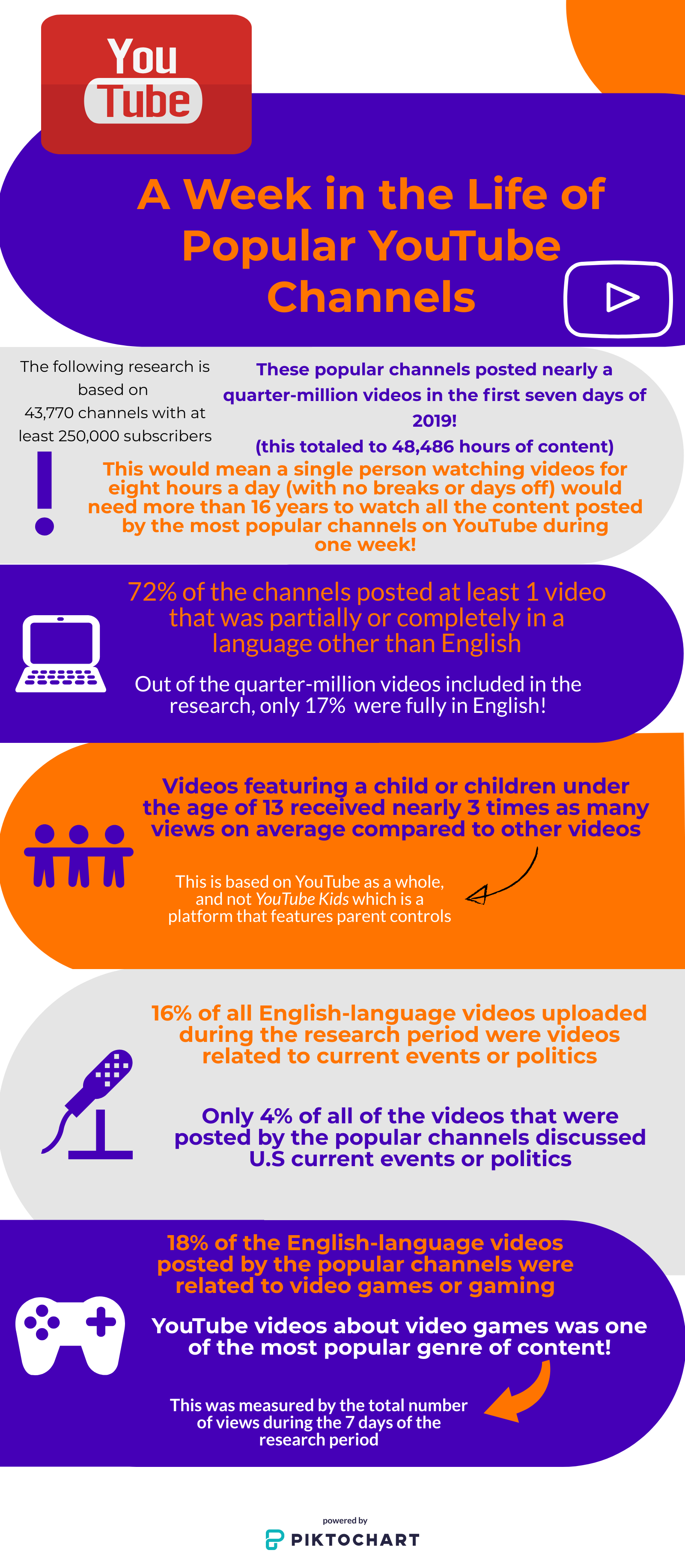
Here is an infographic I created after reading an article from Pew Research Center titled:
A Week in the Life of Popular YouTube Channels
If you would like to read more on the data that I collected, you can find the article here:
Reference:
Van Kessel, P., Toor, S., & Smith, A. (2019, July 25). A Week in the Life of Popular YouTube Channels. Pew Research Center. https://www.pewresearch.org/internet/2019/07/25/a-week-in-the-life-of-popular-youtube-channels/.

Hi! I agree with you, Piktochart is the option out of the three. I liked using Piktochart the most because it is simple to use and it provides a lot of template options. I also enjoyed your infographic on YouTube channels. It is crazy how many videos are posted and how we reliable we are on YouTube. Thanks for sharing!
ReplyDeleteYour infographic is extremely well put together and easy to read. When doing the assignment, I decided on Infogram as my favorite, mostly due to the chart and graph features it offered. I liked Piktochart for their different design and template options, and if I were using infographics in class, I would definiteily recommend Piktochart or Easelly with students due to many of the features you described here.
ReplyDeleteHi Amanda,
ReplyDeleteI liked Piktochart best as well. I found it much easier to navigate. The information on your Piktochart was very eye opening! Especially the one about videos featuring younger children are viewed three times more. Yikes!
I liked the connection that you drew with creating anchor charts by hand in the classroom and creating virtual infographics. This would be a great way to explain the creation of infographics to teachers. If we appeal to the fact that they are already creating them by hand, they might be more likely to try to create them virtually!
ReplyDeleteI really enjoyed your infographic: A Week in the Life of Popular YouTube Channels. I found it interesting that only 4% of the channels discuss U.S. current events or politics. I bet students and teachers, alike, would be interested in viewing your infographic.
ReplyDelete